


WCAG AA or AAA Compliance Across All Theme Variations
100% of SDS Components Mapped to Tokens
$83,000 Sale as a Result of New Admin Theming Experience
Visual design
Token architecture
Accessibility testing
Token exploration
Token Studio build
Token JSON
CSS Framework
Figma Variables
An audit of the legacy product revealed widespread styling inconsistencies and a fragmented implementation of theming and white-labeling. The Schoox brand itself wasn’t consistently applied, and customers struggled to adapt the product to their own branding. Worse, there was no mechanism to ensure accessibility when custom colors were applied, putting both usability and compliance at risk.
These issues weren’t just aesthetic, they impacted sales and retention, as customers demanded better control over how their platform looked and felt.
Build a scalable token system based on Amazon’s Style Dictionary
Ensure consistent styling across all platforms and components
Support full theming without sacrificing accessibility

Sample of our design token mapping

Tokens implemented as Figma variables

Token layering featuring five levels of abstraction
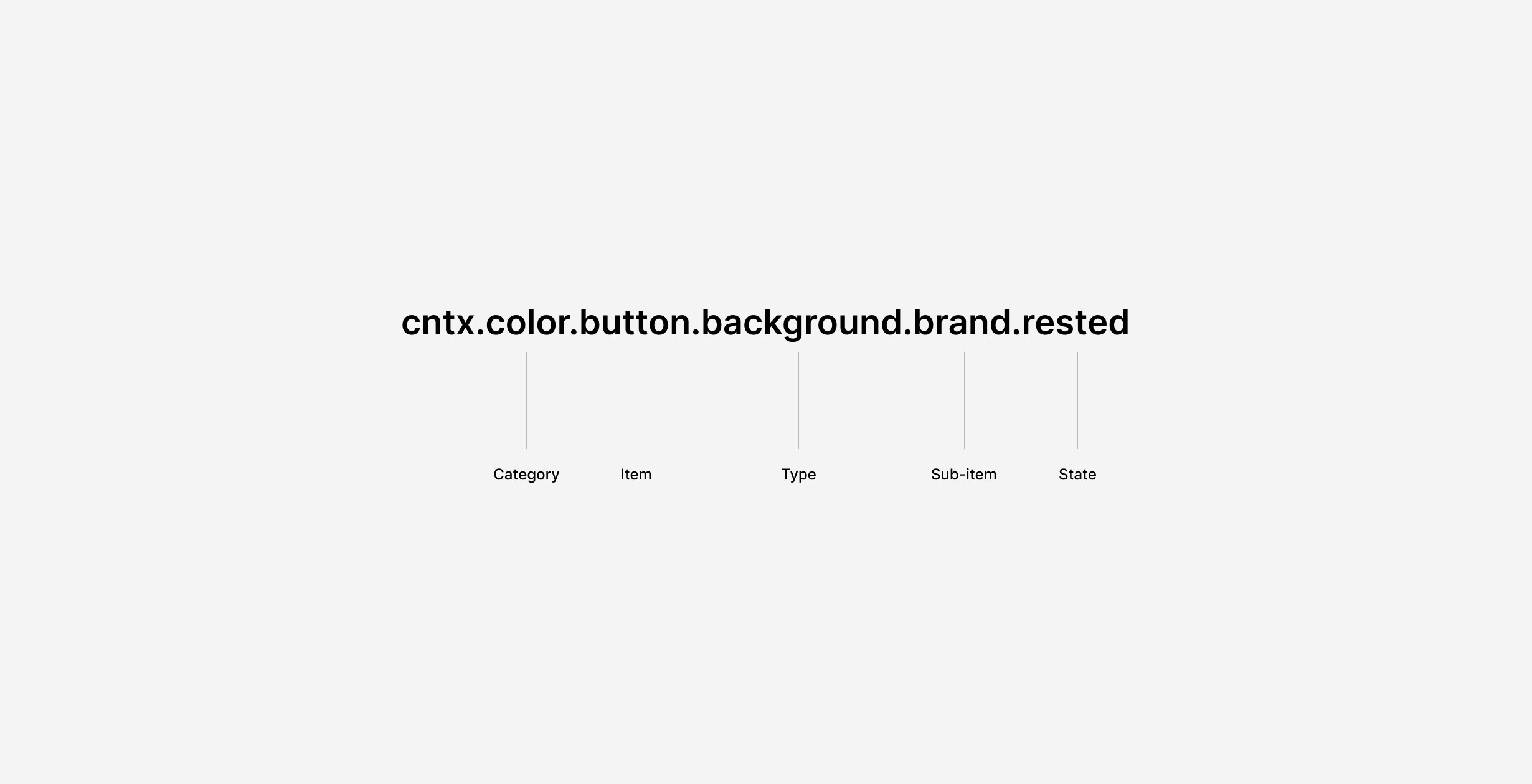
Token naming based on Amazon Style Dictionary
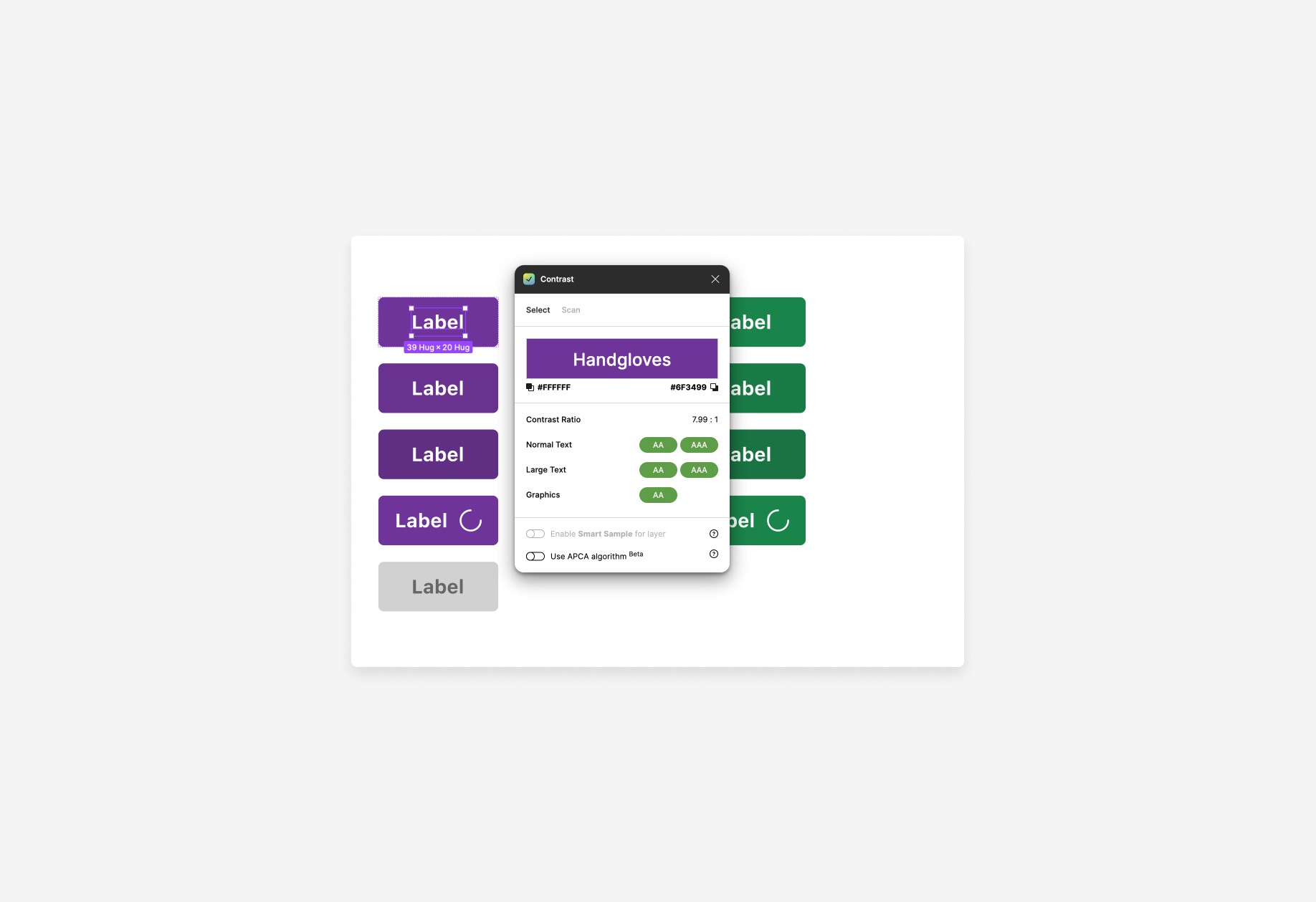
Every component alias was accessibility-tested to meet AA or AAA WCAG standards, even under custom brand configurations. This baseline ensured we could offer flexibility without compromising usability.

Standard Schoox 'Electric Fade' light and dark modes
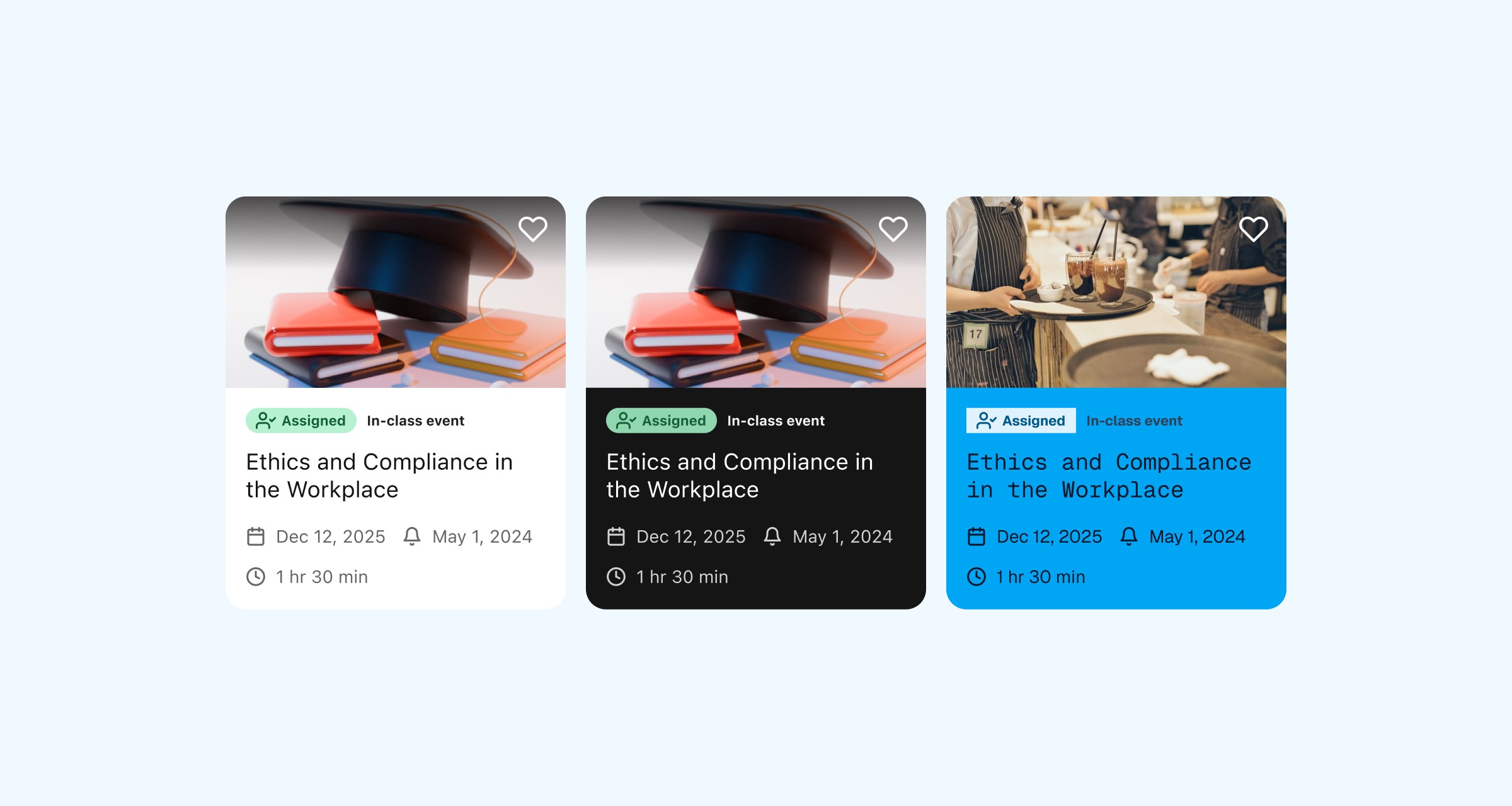
White-labeled themes
Admin Theming Settings
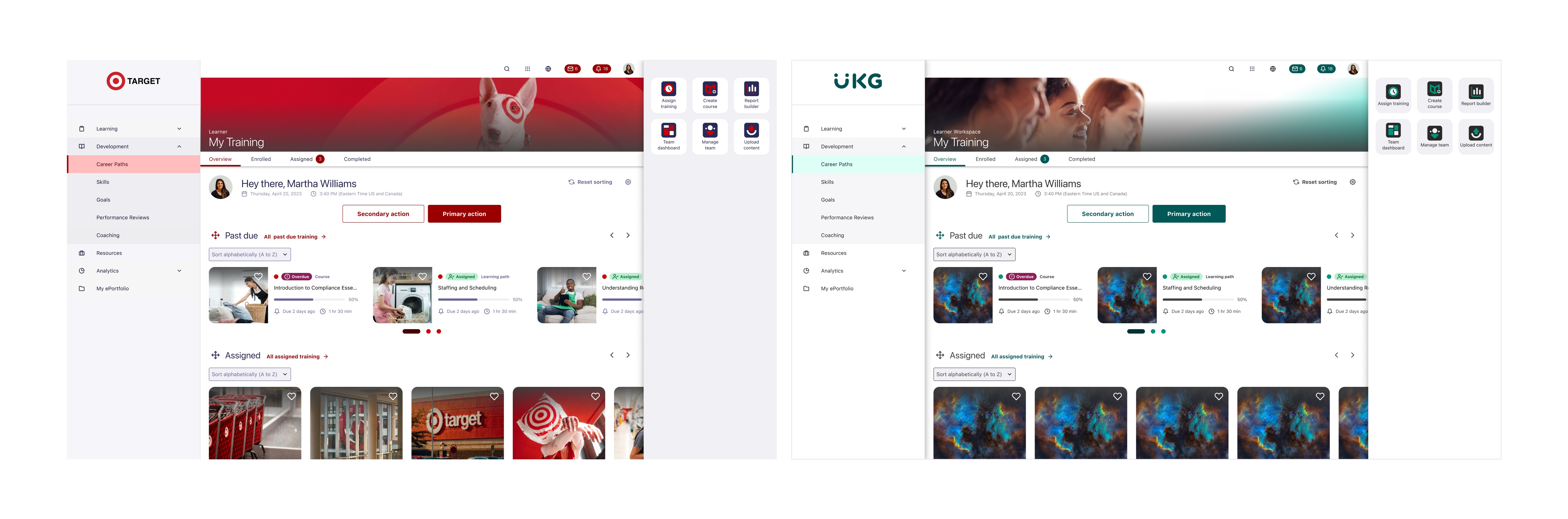
In collaboration with the Experience Design team, I also designed the Academy Admin Theming Panel, a customer-facing interface built on top of the token system. It gave admins granular control over UI elements, enabling self-service branding without breaking design standards. This was a major leap from previous theming tools, aligning our product more closely with customer identity needs.

Academy theming dashboard